
Reviews & Articles
藝術家簡介:簡喬倩 | Artist Profile: Tobe Kan Kiu Sin
John BATTEN
at 11:32am on 19th August 2020
Captions:
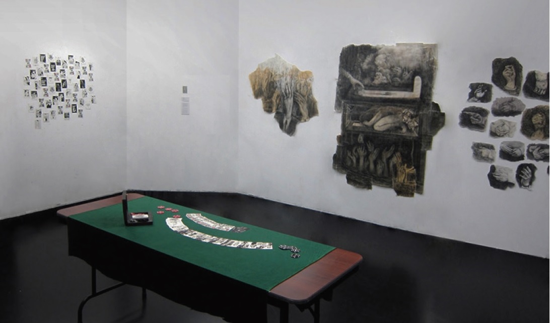
1. Hand, hand and hands and Take over by Tobe Kan Kiu Sin, installation view, 2015. Photo courtesy of the artist.
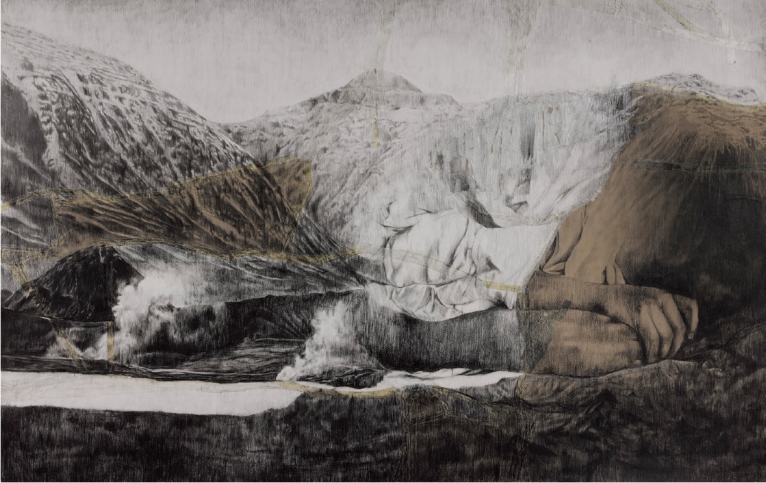
2. Mountain oh mountain I by Tobe Kan Kiu Sin, coloured pencil and tape on paper, 2016. Photo courtesy of the artist.
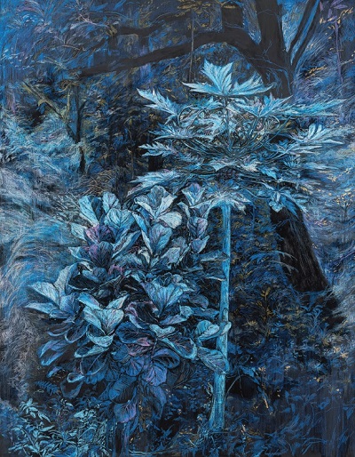
3. Awake 3 by Tobe Kan Kiu Sin, oil pastel on canvas, 2019. Photo courtesy of the artist.
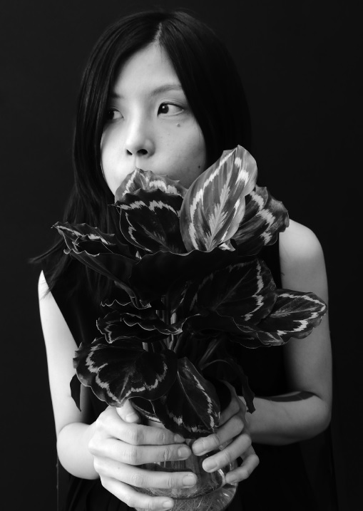
4. Tobe Kan Kiu Sin. Photo courtesy of John Batten.
(Please scroll down for English version)
簡喬倩於2017年畢業於香港藝術學院/澳洲皇家墨爾本理工大學,擁有藝術學位。她的教育相當偶然:她曾向香港另外兩家提供藝術本科課程的有名大學申請,但未獲香港中文大學或香港浸會學院視覺藝術學院取錄。無疑,香港藝術學院的課程較適合她:簡氏的同學並非所有都是剛剛中學畢業,而是和她情況相近,較為成熟。她生於1984年,已有一些工作經驗,而且對自資視覺藝術的研習有著深思熟慮的承擔。
簡喬倩最初報讀雕塑,但隨即轉投繪畫,她的導師包括藝術學院教師及藝術家馬琼珠和校友藝術家李美娟。2018年,簡氏在思聯(CL3)工作室舉行的首次個展《啄眼的烏鴉》,正是由李美娟策展。
簡喬倩在香港粉嶺和觀塘區長大,在一家「不錯,競爭不大」的中學唸書。她最初的作品,是和同窗一同以Photoshop湊合而成的手製小書冊和小雜誌。2005年,她在香港城市大學完成了副學士學位,當時對動漫特別感興趣。她是典型根基扎實的設計師,清晰線條,使用的手法屬現代主義。
由設計師轉型為視覺藝術家需要在思維上轉變,所以道路從來不會暢順易走。兩者的主要分別,在於設計師為客戶工作,而藝術家則為自己工作。視覺藝術家的挑戰來自她自己的限制,而設計師則受制於客戶要求。視覺藝術家可以犯錯,而且有機會學習、實驗和設定自己的挑戰。簡氏當時樂於日間當設計師,其他時間當藝術家的生活。
畢業後她從事設計工作。到了2011年,她在柏林旅居了一年,在兩家獨立設計工作室當實習生。這段經歷對她日後的生活起了決定性的作用。其中一家工作室的設計總監鼓勵簡氏探索個人創意。她在柏林的日子和遊歷歐洲時間參觀了很多博物館,體會了其他創作手法,鼓勵了她考慮發展自己的非設計創意。2012年回港後,她與友人周煦卓和兩位藝術家張惠文及何倩彤在火炭合租了工作室。互相支持、一同努力工作的環境,讓簡氏認識到藝術家工作室的實況,她也在這裡得到關於繪畫技巧和物料的意見,有助發展自己的繪畫作品。這段經驗也鞏固了她開展正規視覺藝術研習的野心。我記得那時候看過她的學生時代小風景畫習作,這些親密的作品顯示出她已掌握了成熟的技巧,還有本科生中不常見的美學感性。
簡氏首次呈現了獨有風格的端倪,是在她勇敢地選擇了在咖啡/灰綠色的工業用粗燥包裝紙上作畫。這種密度大的基底材質襯托了簡氏在2015年的早期作品《手.手.手》和《Take over, overtake》上所表達的意念,她運用了縐紋膠紙、鉛筆和粉彩,是首次個展混合媒體畫作的先行作品。
簡氏現時的作品,很多都以個人所失、家人的抑鬱和傷痛為主調,但實際上很少透露關於她自己的事情。如果你與她見面,會發現她從頭到腳都穿上重度黑色,但人卻一點都不黑心:她處處流露出關懷和人性。同樣地,她的作品在類型上,屬表現主義,涉及心理起伏,是愛德華.蒙克的手法多於尖銳的虛無主義死胡同派。她的作品令人振奮而且啟發思考。一系列大型風景畫和拼貼畫作《山又山.一/二/三》(2016年)描繪了憂傷、趴睡或昏迷的人物,近乎融入隱於背景中,躺臥在山上和深谷的風景畫情景。風景和融入周圍環境的人物是簡氏的心理腦圖,她在自己的詩作中這樣解釋:「他人的苦難是高山/你永遠不能跨越/你永遠無法承擔/最痛苦是想像他人的創傷」。
我喜歡簡氏準備跳出她已選為核心媒體的繪畫,走進雕塑和之前的視像領域。她的混合媒體作品《沒藥》(2016年)是一個藥櫃,盛載著由簡氏以紙製成,加上手寫標誌的藥瓶和抗抑鬱藥等不同藥物。沒藥這種藥用樹脂,是三位智者恭賀耶穌出生的禮物,粵語讀音聽起來是「沒有藥」。簡氏以這種跨語言的荒謬顯示出她作品中呈現較輕巧的手法,還有中國人對精神病的評價。簡氏素來都探討嚴肅主題,她對藥櫃作出這樣的總結:「我不是教徒,只是被其諧音吸引。世上太多無可救藥,唯有自救,減輕痛苦。」
簡氏在思聯(CL3)工作室舉行的個展中,她把一些富動感的雕塑燈箱放在頂部打開的木箱內展出。透過費納奇鏡(戲院出現出的頻閃影像裝置),她把一系列自家畫作化為移動影像。讀者可以在簡氏的網站上欣賞《惡痛與分身(與幻覺)・一/二/三》(2018年):鳥兒在飛、睜開和閉上的眼晴,還有月亮在圓缺之間急速改變。畫作和動力影像的靈感源自電影,包括希治閣的《鳥》(1963年)。這些都神秘地暗喻了藝術家的年齡,還有她母親出生的月份和日期。
簡氏近期的繪畫作品出現了新的演進轉變。她在畫布上以油粉彩而不是油彩作畫。因為她認為油彩「太水性/太抽象」。這些作品於2019年年底在Exit安全口 ,以及今年於香港藝術中心的聯展「愈 ‧ 夜舞」中展出。簡氏參考了樹木和零碎灌木的照片,這些影像來自她現時工作室附近和柴灣的墳場和公園。她把影像轉移到畫布上,經過重新想像,刻劃成孤立的樹木、盆栽又或是茂密青葱的葉子——通常只以有限的色彩或黑白兩色呈現。香港過去12個月經歷的政治和社會動盪遍地開花,而簡氏感同身受的回應也影響了這些草木畫作。她的《甦生》畫作系列把比例放大,令人印象難忘,現在以耀目誘人的調子表達:閃閃發亮的海藍色。然而,她在畫中選用的美麗藍色色調卻是刻意反映香港2019年夏末的連場示威。作品中的藍色,正是警方強攻驅散街上示威者時所用、加入了胡椒噴霧的水炮車藍色水柱。這種染藍的水沾污了所有被它碰過的東西。因為它對準人,周圍的石屎街道、草、樹,還有眾所周知,位於彌敦道的九龍清真寺,統統都被染成藍色。
簡氏的很快便從青澀的學生一躍成為才情橫溢的藝術家,她的作品令人刮目相看,呈現的視覺意念展示出複雜、成熟、感性和細緻的政治觸覺。她筆下的樹林暗喻著香港抗爭者——被藍色染料覆蓋、眼睛和皮膚都在刺痛著,他們呼吸困難,發出懇求的聲音:「我無法呼吸」。
*本文寫於2020年5月25日非裔美國人弗洛伊德在美國明尼阿波利斯逝世後數星期,弗洛伊德因被警察跪頸致死,臨終時他說道:「我無法呼吸」。他的窒息身亡觸發了美國全國和世界多個大城市的連場示威。對於警方過度進擊和使用過份武力的類似批評,在2019至2020年間香港示威活動中也常有所聞。
原文刊於《藝源》,2020年7月。
Artist Profile: Tobe Kan Kiu Sin
by John Batten
Tobe Kan Kiu Sin graduated from the Hong Kong Art School/RMIT University with a fine arts degree in 2017. It was a fortuitous education: she had previously applied but was not accepted into Hong Kong’s two other established fine arts undergraduate programmes, at The Chinese University of Hong Kong and Hong Kong Baptist University’s Academy of Visual Arts. Undoubtedly, the art school’s programme was more suitable for her. Kan’s fellow students were not all fresh secondary school graduates, but similar to her: a bit more mature – she was born in 1984 – with some work experience and a thoughtful commitment to the self-financed study of visual art.
Initially enrolled in the sculpture stream of the course, she immediately moved to painting, where her mentors included Art School teacher and artist Ivy Ma and alumni artist Carol Lee Mei Kuen, with Lee curating Kan’s first solo exhibition, Peck-eyes Ravens, at the studio of CL3 Architects in 2018.
Kan grew up in Hong Kong’s Fanling and Kwun Tong districts and went to a “nice, not competitive” secondary school. Her first works were little handmade books and zines, cobbled together with a school friend using Photoshop. In 2005, she completed an associate degree in design at City University of Hong Kong, with a strong interest in animation and anime. Kan is a classically solid designer, with clean lines and a modernist approach.
The move from designer to visual artist is never smooth. It requires a mind shift. The difference is often stated as: a designer works for a client, whereas an artist works for themselves. The visual artist is challenged by her own limitations, a designer by the limitations of a client. The visual artist can make mistakes and has the chance to learn, experiment and set personal challenges. Kan has embraced being a designer by day and an artist at all other times.
After graduating she worked in design. Then, in 2011, she lived in Berlin for a year, working as an intern in two independent design studios. This experience was life defining. The design director at one of the studios encouraged Kan to explore her personal creativity. Her time in Berlin and travelling in Europe, visiting museums and experiencing other creative approaches, encouraged her to consider developing her non-design creativity. On her return to Hong Kong in 2012 she shared a studio in Fo Tan with her friend Cheryl Chow and artists Cheung Wai-man and Ho Sin Tung. This supportive, hard-working environment gave Kan an introduction to a working artists’ studio, and advice on technique and materials to develop her own painting and drawing. It also solidified her ambition to begin formal visual art studies. I remember seeing, at that time, the small, intimate landscape paintings she had done as a student exercise. They displayed a mature grasp of technique and an aesthetic sensitivity unusual for an undergraduate.
The first inkling of Kan developing her own style was her brave choice to draw on brown-grey-greenish, rough, industrial wrapping paper. This dense base material complements the ideas seen in Kan’s early drawings, Hand, hand and hands and Take over, overtake (both 2015), using masking tape, pencils and pastels – forerunners of the mixed-media drawings seen in her first solo exhibition.
Personal loss, depression within her family and sadness underlie much of Kan’s current work – but little, actually, is revealed about herself. If you meet her, she dresses in severe black from head to toe, but is far from black-hearted: she exudes care and humanity. Likewise, her art: it is, for want of a genre, expressionist and deals with psychological ups and downs, an Edvard Munch approach, rather than a razor-blade-nihilist, dead-end one; her work is uplifting and thought-provoking. A series of large landscape and collage drawings, Mountain oh mountain I, II and III (2016), depict sad, prone sleeping or comatose figures lying, almost camouflaged, across mountain and deep valley landscape scenes. The physical landscape with figures blending into the surroundings serves as a psychological mind map that Kan explains in a poem she wrote as, “The suffering of others is like a mountain. / Never will you get over it. / Never will you bear it. / The most painful torture is one’s imagination of others’ trauma.”
I like that Kan is prepared to venture outside her chosen core media of painting and drawing into sculpture and previously video. Her mixed-media medicine cabinet, Myrrh (No medicine) (2016), contains bottles and mixtures of medicine, including anti-depression drugs, fabricated in paper with hand-written signage by Kan. But myrrh, the medicinal resin, given to the newly born Jesus by the Three Wise Men, when spoken, sounds like the Cantonese for “no medicine”. Kan uses this cross-linguistic absurdity to show a lighter approach in her art, and a Chinese appreciation of mental illness. Always tackling serious topics, Kan sums up her medicine cabinet: “I am not a Christian, just attracted by the homonym of myrrh in Chinese. There are too many incurable things in the world. If there is no medicine to heal, only self-help could reduce this suffering.”
Kan’s kinetic, sculptural lightboxes, housed in top-opening wooden boxes, were exhibited at her CL3 studio exhibition. She used a series of her own drawings transformed into moving images by a pre-cinema stroboscopic moving-image device known as a phenakistiscope. Le Mal, Double (and Hallucination) I/II/III (2018) can be viewed on her website: birds are flying, eyes are opening and closing, and the moon is viewed quickly changing through its phases. Her drawings and the resulting kinetic images are inspired by movies, including Alfred Hitchcock’s The Birds (1963). They are a mystical metaphor for the artist’s age and the month and day of her mother’s birth.
Kan’s recent paintings take a new, evolving turn, using oil pastel on canvas, rather than paint, which she considers to be “too watery / too abstract”. These were exhibited at Gallery Exit in late 2019, and this year at In the course of Dancing, from Nightfall to Darkness, a group exhibition at the Hong Kong Arts Centre. Kan takes reference photographs of trees and patchy undergrowth, close to her current studio and Chai Wan’s cemeteries and parks. These are transformed on canvas, reimagined, depicted as lone trees, pot plants or dense, verdant foliage – usually in a tight choice of colours or black and white. Hong Kong’s political and social unrest during the past 12 months is pervasive and Kan’s heartfelt reaction has affected these lush paintings. Her Awake series of paintings have been impressively scaled up in size and now shimmer in a tantalising tone: an iridescent aqua blue. However, her choice for paintings in beautiful shades of blue consciously reflects Hong Kong’s late summer 2019 protests, dominated by jets of blue-coloured, pepper-infused water fired from water cannon trucks aggressively used by police to disburse street protesters. This blue-dyed water stained everything it touched. Aimed directly at people, the surrounding concrete streets, grass, trees and, notoriously, the Kowloon Mosque on Nathan Road, were all stained blue.
Kan’s has quickly leapfrogged from raw student to accomplished artist developing impressive visual ideas of complexity, maturity, sensitivity and political nuance. Her painted forests of trees are metaphors for groups of Hong Kong protesters – covered in blue dye, eyes and skin stinging, their breath constricted, their voices pleading: “I can’t breathe.”
*This essay was written in the weeks after African-American George Floyd died on 25 May 2020 in Minneapolis, USA after a policeman held Floyd’s neck down with his knee as Floyd pleaded, “I can’t breathe.” His suffocation triggered protests across the USA and in major cities around the world. Similar criticism of overly aggressive, violent policing has dogged the police throughout the 2019-2020 protests in Hong Kong.
This was originally published in Artomity magazine in July 2020.